The meaning behind Axiom’s sleek brand refresh

Axiom has been creating thriving workplaces for over 25 years and like the rest of the world, we are evolving.
We have completed an extensive brand refresh to better showcase the high-calibre design and delivery of our projects. Our advanced service offering has seen us working with large enterprise-level clients in our portfolio and an increase in the scale and complexity of projects we’ve delivered. And one constant of Axiom has always remained - being at the helm of pioneering ways to work.
This new chapter brings much excitement for the ever-growing Axiom brand and we are delighted to be sharing the story behind our vision with you.
The strategy
The strategy for our brand refresh came from the main ingredient to our success - our people. We had conversations with our teams to understand what the Axiom brand represents, what it offers and where the brand could go. Then, we consulted our clients and asked them a similar series of questions, digging a little deeper into how Axiom has helped reshape workplaces.
These discussions made one thing crystal clear - Axiom catalyses revolutionary spaces and ways to work.
So, we paired our many years of experience in the industry with the genius creatives from Thursday Design to evolve the brand.
The design
The elegant redesign of the brand reflects Axiom’s culture of creating intuitive, modern and thriving workplaces. It boasts simplicity and sophistication which represents our organisation’s values. In this way, our new look better communicates our story all through clear, perceptive and refined visual language. Our brand image serves not only as a piece of identity but also a source of inspiration.
As our work aims to meet the business demands of the future through equally functional and innovative approaches, so does the tone of our brand refresh.
The motif
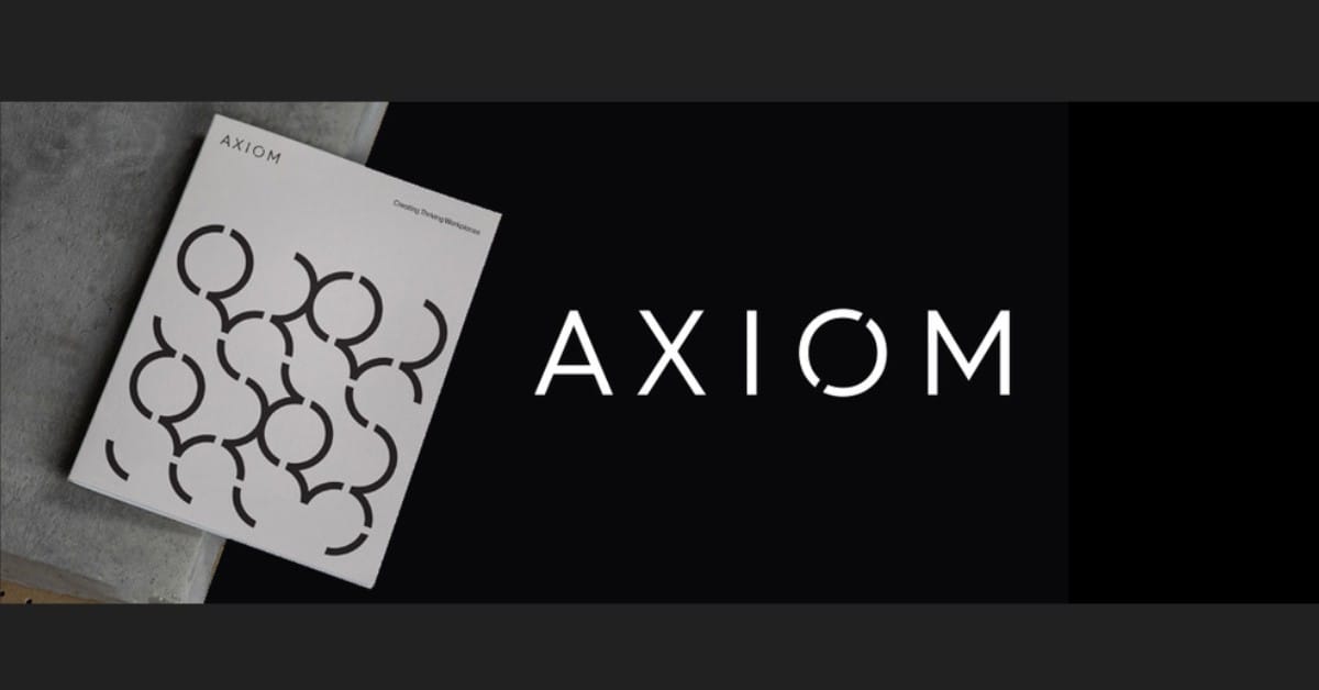
The ‘o’ motif with the diagonal line through the middle represents the axis of change, reflective of Axiom’s spearheading capability to produce forward-thinking and meaningful workplaces. This is also a nod to the old brand design which had the actual axis of change, a 22.5-degree line angle. It has been modified to align with the ‘X’ in our name, but still holds an element of continuity with the old brand.
The brand pattern of the recurring ‘o’ promotes a sense of fluidity in its circular shape and is symbolically and distinctively Axiom. With the repetition of the ‘o’, we’re emulating our ongoing and unrivalled offering of providing state-of-the-art workplaces to modern businesses.
The hero: our work
Our work is the hero of our brand identity and we’ve repositioned this to be at the forefront, accompanied by a design that doesn’t overpower or detract from the work but rather, complements it. In this way, we can show off our impressive portfolio and the clients we work with.
- Through photography - we showcase our thriving workplaces with the well-executed photography taking centre stage in our rebrand. The images that were shot naturally work harmoniously with the textures and colours within the brand’s style. This uninhibitedly displays the cutting-edge and flourishing workplaces we’ve created.
- Through colour - the new colour palette reflects Axiom’s respectful and thoughtful design. This incorporates restrained monochrome colours and elegant tones that support the extensive use of photography to further amplify the work itself. The secondary colours contrast this and are only used to highlight a data-driven design approach within charts and graphs.
- Through typography - the brand typography is robust yet suave. With its clarity, it better represents the nature of the brand and culture while cooperating with the colour palette, graphics, and Axiom’s reputation built upon the sleek, intelligent design.
And so, we bring you the all-new and exciting Axiom rebrand - where sophisticated design meets innovative practicality.
For more inspiration on how to make your future workplace thrive, read about our work and its positive impact on organisations.


