“We should pay homage to our tradies.”
Jodette Cleary, Chief People Officer, hipages
As Australia’s number one site for hiring tradies, hipages wanted to redesign their Sydney-based headquarters to make it feel like a second home to their staff. A typical corporate space, the office needed a homely readjustment to bring the aspects of home and work together and optimise employees to their fullest.
Before Axiom…
The original hipages office space was a traditional corporate space that lacked natural light and distinctly felt like a place away from home. With the goal of creating a sense of home, the hipages headquarters provided the perfect canvas for the Axiom Workplaces team to employ creativity and think beyond the usual design for corporate spaces.
Axiom’s Managing Director, Shane Hales, describes the undertaking as “applying creative thinking to not only align with our client’s commercial objectives but to create that unique environment of an unconventional workplace design.”
First impressions are important and, in keeping with this philosophy, Axiom wanted to create a memorable experience for hipages staff, clients and visitors when entering the main floor.
Axiom’s Senior Workplace Strategist explains the team’s approach: “We had to ‘de-corporatise’ the space to get that homely feel. The most important thing was in the selection of the details – things that you would see at home. All the little details came together to make up the full picture.”
“You don’t often see this attention to detail in corporate projects, and it’s usually a removed decision-making process. But not with this project.”
The structure of the building had potential, already standing head and shoulders above most corporate spaces in Sydney. It housed a balcony, with ability for a second one. But the existing balcony was a sorry sight, in desperate need of a makeover. This was a challenge relished by Axiom’s design team.
After Axiom…
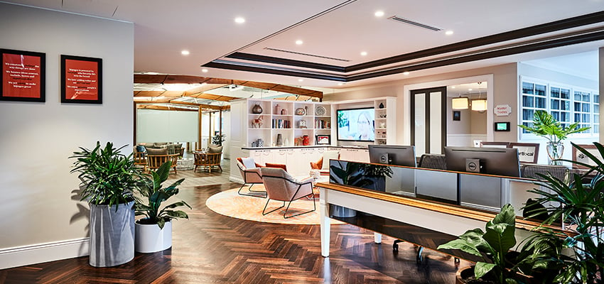
The team drew design inspiration from the exterior of a typical house – with brick cladding – but combined it with state-of-the-art technology. The lobby was stripped-back to project the hipages logo onto the floor, to signal innovation but also authenticity. The colours echo those in the hipages corporate palette. The entrance is a typical domestic front door, beginning the immersive experience and reinforcing the feeling of having arrived at home.
“Even the door framing was chosen for domesticity, rather than the typical aluminium framing, And the choice of carpet was soft and luxurious, the kind of carpet that makes you want to throw off your shoes and sink your toes into it.”
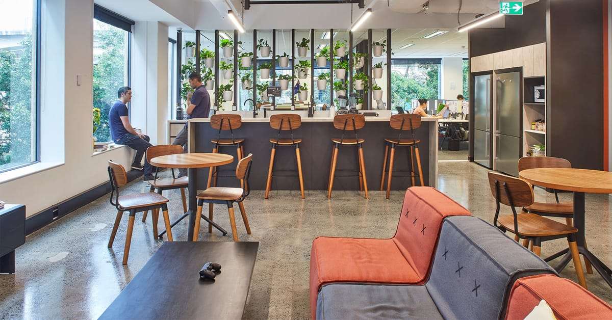
The real heart of the project and hipages home was the kitchen and adjacent ‘family’ rumpus room, together making it the team’s ‘town hall’. The area has multiple access points to avoid congestion, and an extended island bench ensures there is sufficient space for catering during hipages’ famous team functions.
Both of these casual time-out spaces are positioned away from general work areas to provide staff with the permission to truly relax, while not being concerned their actions and conversations may be distracting co-workers.
Axiom was inspired to create a piece of wall art with the hipages team as artists, something that is visually interesting but does not dominate the space. This artwork is also a sneaky method for concealing a base building services door, while having some abstract fun.
On hiding other unsightly and high-rise sights, “We hung curtains over the building services cupboard so instead of being greeted at reception with the firedoor and hydraulics, it’s all covered up with a floral curtain. That also helped to soften everything.”
To bring in natural light, Axiom took advantage of the balcony, terrace and deck area to provide a softer visual impact. It was decided to cover the side walls in murals that reflected the workstation screen colours, effectively melding the outside and inside to make it feel like one seamless space, and to extend the office outwards and provide an opportunity for staff to work in the fresh air – weather permitting.
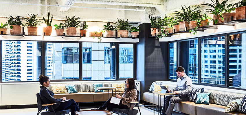
Centralised recycling stations were installed alongside the hydration stations and printing facilities. Existing furniture and partitioning was all re-used where it was feasible to meet the requirements. Bringing fresh, green plants into the space is yet another homely touch that invigorates and provides health benefits for everyone.
When asked for the most satisfying element of the hipages project, the Axiom team says, “Reflecting the client’s personality. You walk in and it really feels like hipages home.”
At a glance…
-
- Designed to visually reflect brand
- Homely integration to a corporate space
- Green elements to emphasise natural element
- Sustainable practice


