Posts by Donna Zampino:

Design File: Axis Communications

Design File: Axis Communications

Axis Communications is an integrated technology solution provider that manufactures network cameras for the physical security and video surveillance industries. They offer solutions based on sight, sound and analytics to improve security and optimise business performance for their customers.

Before Axiom…

Axis is in the process of shifting their brand from being a security hardware provider to a company that provides integrated technology solutions. With a 10-year lease in their large space, Axis was ready to transform their workplace to align with their new vision and direction.

The brief was a high-energy workplace that seamlessly connected staff inside and outside the local office with collaboration spaces and best-in-class communications technology. All of this was to happen within an expansive, yet personalised, experiential environment. 

The business had a unique opportunity to create an Experience Centre, a multi-purpose space that showcases leading-edge technology to clients as an experiential journey. The brief was to use design to finely balance seemingly opposing constructs of cutting-edge technology with a welcoming, friendly feel.

After Axiom…

With the journey as the central design concept, we designed the Axis Experience Centre as a sequence of client experiences that visually guided clients. 

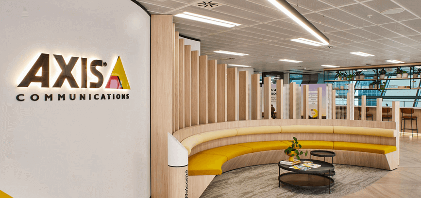
The experience begins with the arrival – an energetic welcome, with a dramatic and tech-inspired back-lit foyer. As the explorer proceeds throughout, they find the showcased technology embedded in softened colours, textures, and environmental graphics. The Experience Centre enjoys natural light and the space features a prominent social gathering area, instilling an immediate connection with both people and the outside environment. 

“The Axis team wanted its front-of-house showcase to be experienced as a journey – one that finely balanced the seemingly opposing constructs of cutting edge technology with a welcoming, friendly feel”. – Annelie Xenofontos, Senior Associate Strategy

Based on the concept of The Golden Mile, we deployed a range of integrated design techniques to guide the journey including colour-blocking to highlight different aspects of the narrative, backlighting for visual effect, angled linear lighting for dramatic effect, reflective finishes and textural play for interest and energy, as well as 3d wayfinding.

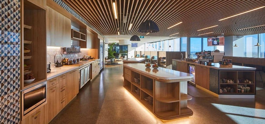
An equally inspiring journey has been created for staff. The team space features a large break-out space that capitalises on the view (with the hallowed MCG to the left and Port Phillip Bay to the right) and offers ample amenities while featuring varied work points, focus spaces and collaboration spaces. 

“Meanwhile, back-of-house was endowed with diverse yet well-connected work points, multiple collaboration areas as well as access to the view and all amenities”. – Annelie Xenofontos, Senior Associate Strategy

This was a job of balance and connection, bringing function and design together into a seamless journey for both clients and staff. 

At a glance

  • Two spaces, distinct, yet connected, technologically enabled, yet welcoming
  • Simple Scandi-style design, consistent and complementary to their headquarters in Lund, Sweden
  • Longevity and low maintenance in both design and materials
  • Used sustainable products and materials to complement their  6-star green building and a 5-star NABERS rating

Ready for Axiom to work their workplace strategy and design magic on your current or new office space? Book a free virtual consultation today to see what we can do for you.

Axiom Workplaces combines your commercial fitout and workplace design goals with our experience and expertise in evidence-based office design to create a thriving workplace for you and your workforce.

Workspace design trends shaping the future of work in 2021

Workspace design trends shaping the future of work in 2021

It’s 2021, and the office’s role has changed. COVID-19 has accelerated the future of work and quickly evolved the way office spaces need to function. Workspaces are feeling more like safe, homely spaces, enticing employees back into the office environment.

Naturally, this sees some interesting trends emerge in workplace design: greenery and green credentials are increasingly important, designs are incorporating virtual connections more than ever before, the unpredictable environment is driving flexible, agile spaces that are ready for anything.

Let’s explore what these 2021 workspace design trends look like in practice.

Workplace design trend 1: Make it feel like home with resimercial design

Resimercial design mixes residential and commercial characteristics to create a workspace which feels ‘homely’. The trend began as the Millenial and Gen Z generations entered the workforce. They grew up with technology which enabled the notion of working anytime and anywhere and with that came new expectations around the workplace – comfort, convenience and warmth. Of course, the pandemic accelerated the trend as more and more people began working from home for a significant amount of time and now prefer certain creature comforts in the workplace too.

Done right, resimercial design introduces employees to natural daylight, freedom to choose where to sit and flexibility around where work is done. On a more surface level, expect to see more comfortable furnishings and decorative additions usually associated with the home such as soft furnishings, warm lighting, framed wall decor and a more domestic colour palette.

Professional office features are still critical; quiet spaces for deep work, private places for phone conversations, meeting rooms and practical lighting.

Workplace design trend 2: The greener the better

The humble office plant isn’t new, but in 2021 expect to see greenery taken to the next level as the focus on employee wellbeing continues to grow. Biophilic design isn’t just about a pot on a desk – although that’s a good start. It is about introducing nature more profoundly into internal and external design, to reconnect with nature and bring the outdoors in. Think living green walls, plant partitions (a more aesthetically pleasing take on the perspex screens which have almost become ubiquitous), indoor office gardens and even marine ‘gardens’, complete with fish, built into seating or breakout areas.

Nature is well known to boost mood, reduce anxiety and stress, and improve air quality, promoting employee health and wellbeing outcomes.

It’s not just about the plants though, green design goes further, extending to more sustainable office design. Employers and employees are more conscious than ever about their environmental impact. In 2021, expect to see more sustainable materials being used in office design and innovative solutions to encourage greener choices within the workplace.

Workplace design trend 3: Virtual first

Videoconferencing technology has played a vital role in the past year to facilitate connection and collaboration. While most offices have reopened in Australia, there have had to be concessions made with physical distancing and a general shift to more flexible ways of working. The physical workplace has had to adapt.

Expect to see:

  • More screens (multiple in meeting rooms to patch in remote workers), cameras and microphones
  • Smart interactive whiteboards for onsite and offsite collaboration
  • Design that promotes good acoustics for effective conferencing
  • Small and private designated video conferencing rooms

Workplace design trend 4: Focus on design as part of your employer brand

We’ve always believed that office space is an extension of your brand’s DNA. And in 2021, more and more companies are using their workplace’s design to strengthen their employer brand, and attract and retain top talent.

No longer are offices only seen by employees or those who make it to the recruitment process’s interview stage. Now workplaces are showcased across social media as Millenials and Gen Z share their offices on TikTok, Instagram and Snapchat. Add to this the screen time your office gets via webinars or how it is reviewed on sites like Glassdoor, and it’s clear that your workplace needs to put your brand’s best foot forward.

Every day we help businesses to leverage and showcase their employer brand through their office design – take a look at some examples.

Workplace design trend 5: Movable and modular furniture

In 2021, office design can’t afford to be stagnant or fixed. For it to be practical and responsive to evolving requirements, it needs to be flexible. Physical distancing, split shifts, and hybrid work arrangements have all magnified the growing need for more flexibility in the workplace.

Expect to see modular furniture that can be moved and adjusted to suit distancing requirements or new working patterns. Movable desks, chairs, partitions and walls, and even whole cubicles will make up the new flexible office design.

Want to look beyond 2021 in workspace design? Find out more wit the Future of Work: A Progressive Leaders Guide To Staying Ahead.

Design File: Cisco Meraki

Design File: Cisco Meraki


“This is an amazing space where everybody can come together in all sorts of different ways. This is how we created real buzz and energy in the organisation through the design and layout.” – Karen, Interior Designer, Axiom Workplaces

Founded in 2006, Cisco Meraki is the industry leader in cloud-managed IT. With more than two million active networks and 5.7 million devices online, the company develops simple yet powerful solutions that help businesses worldwide save time and money.

Before Axiom…

The project focused on Cisco Meraki’s desire to combine US and Australian office cultures into an efficient and productive working environment. The company wanted to build a workplace that effectively blended the best of both worlds. “One of the main challenges was bringing together a San Francisco-based company and a Sydney-based company – asking ourselves: How could we integrate them subtly and intelligently?” explained Karen, an interior designer with Axiom Workplaces.

Cisco Meraki also wanted to create a strong sense of culture and community within the organisation, a goal that was especially important because they were amalgamating two different companies.

Finally, the company needed to address the lack of appropriate meeting rooms and collaboration spaces.

After Axiom…

The team at Axiom did significant research and planning on how to integrate the cultures of the two cities in the colour scheme and design. They studied iconic aspects of both areas, including the shapes and forms of each city and how they could be expressed within a workplace environment.

In the final design, Sydneysiders’ love of fresh air, greenery and sunshine guided the overall palette of natural tones. From the San Francisco side, the team focused on architectural icons, such as the Painted Ladies’ zigzag rooflines and Lombard Street’s famous switchback road. This inspired the angled workstations that reflect the zigzag typologies and create private spaces where people can breakaway and experience a more relaxed work setting.

“The soft colours we found on the Painted Ladies – soft pinks, terracottas and sage greens – integrated beautifully with that Australian aesthetic that we were trying to achieve.” – Karen

A fully functioning commercial kitchen was also designed to hold large breakfasts, lunches and dinners for all staff and visitors. The kitchen opens up to a large breakout area that can facilitate all types of events and conferences.

“We created a workflow that allowed for servery, benches and a coffee area where a barista could come in,” said Donna, another interior designer at Axiom Workplaces.

The kitchen workflow starts with food coming out of the kitchen. People then pick up a plate and walk through the serving areas, reflecting the zigzag configuration. Once done with their meal, everything goes back to the kitchen for cleaning and washing using the commercial equipment. The layout was intended to streamline the process and increase efficiency, especially for large events.

To help build a sense of community within the organisation, Axiom designed workspaces that bring people together, including a coffee bar area and tiered seating purpose-built for the monthly dial-in with San Francisco. Karen described these as “small areas where people can find their individuality among the greater, larger community. We’ve now got an area where everything comes together.”

“Every spot is utilised. There’s somebody in every corner and in every type of furniture. There are people everywhere and they’re really using the space – so that to us is the result that we’re after in the end. That’s the achievement.”

At a glance

  • Integrated two cities through colour scheme and design
  • Angular workstations to create breakout areas in between
  • Fully functioning commercial kitchen and efficient workflow to facilitate large events and meals
  • Breakout area that brings people together, enhancing office culture and community

If you’re growing, downsizing or simply need an office refresh, now’s the time to design a workplace that fits your company’s brand and needs. While your staff work remotely, you can refurbish your workspace so it’s ready for their return. Book a free virtual consultation today to see what we can do for you.

Axiom Workplaces combines your commercial fitout and workplace design goals with our experience and expertise in evidence-based office design to create a thriving workplace for you and your workforce.